
About Antoine Rosier
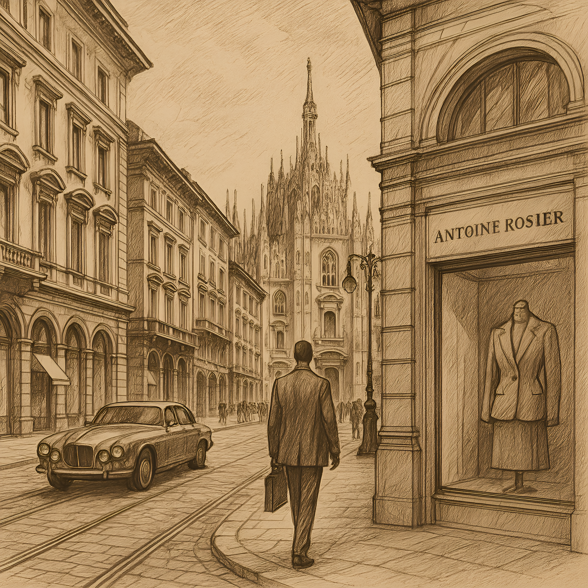
From Milan to the soul of Antoine Rosier
Born from Italian grandeur, Antoine Rosier embodies timeless craftsmanship, quiet strength, and a philosophy where details speak and quality reigns.
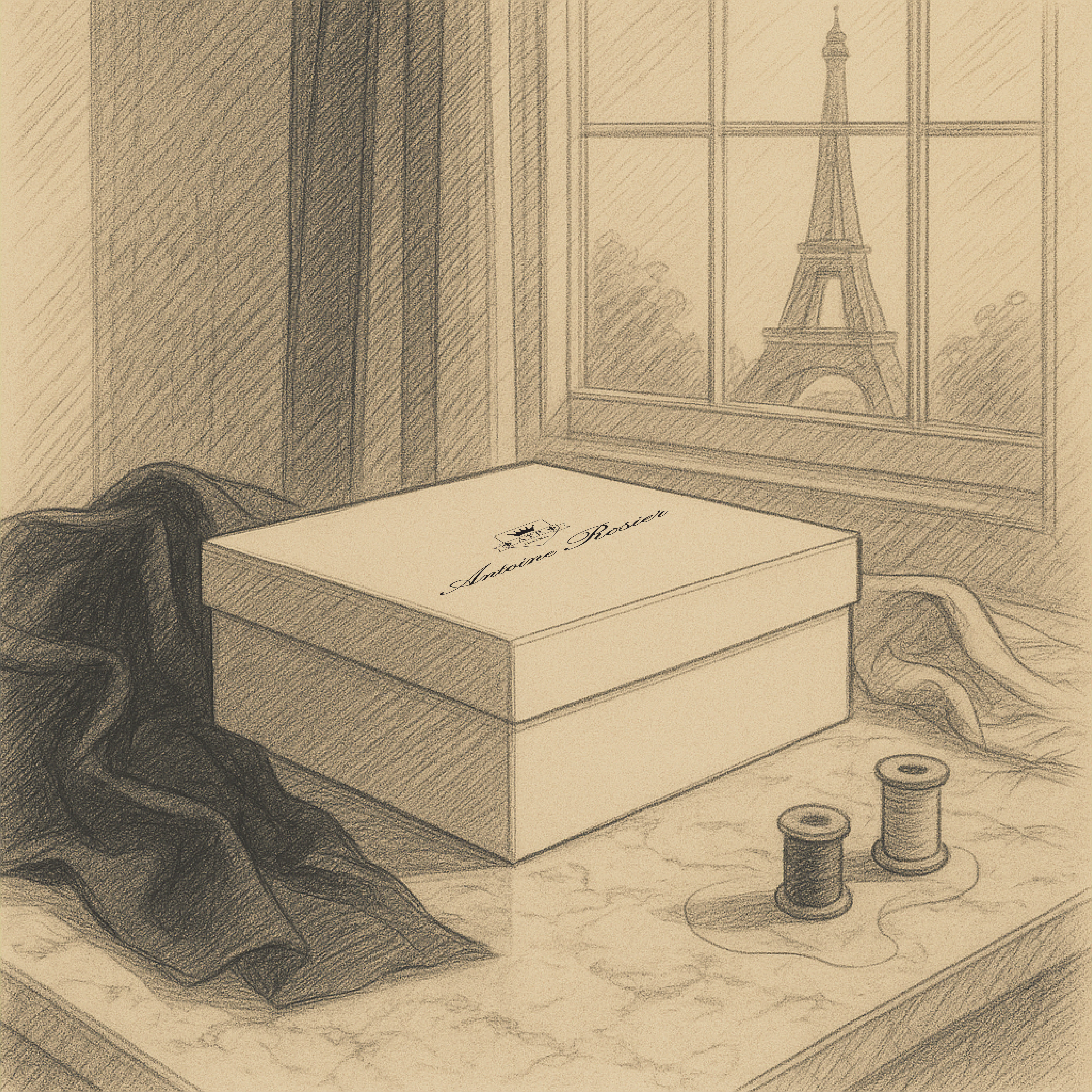
La Fleur-de-Lis L’Essence du Patrimoine Élégant
At Antoine Rosier, every element is chosen with intention; nothing is accidental. The fleur-de-lis, gracefully woven into our logo, is a timeless symbol of heritage, discretion, and understated power. For centuries, it has embodied purity, loyalty, and nobility — values that resonate deeply with the spirit of our maison.
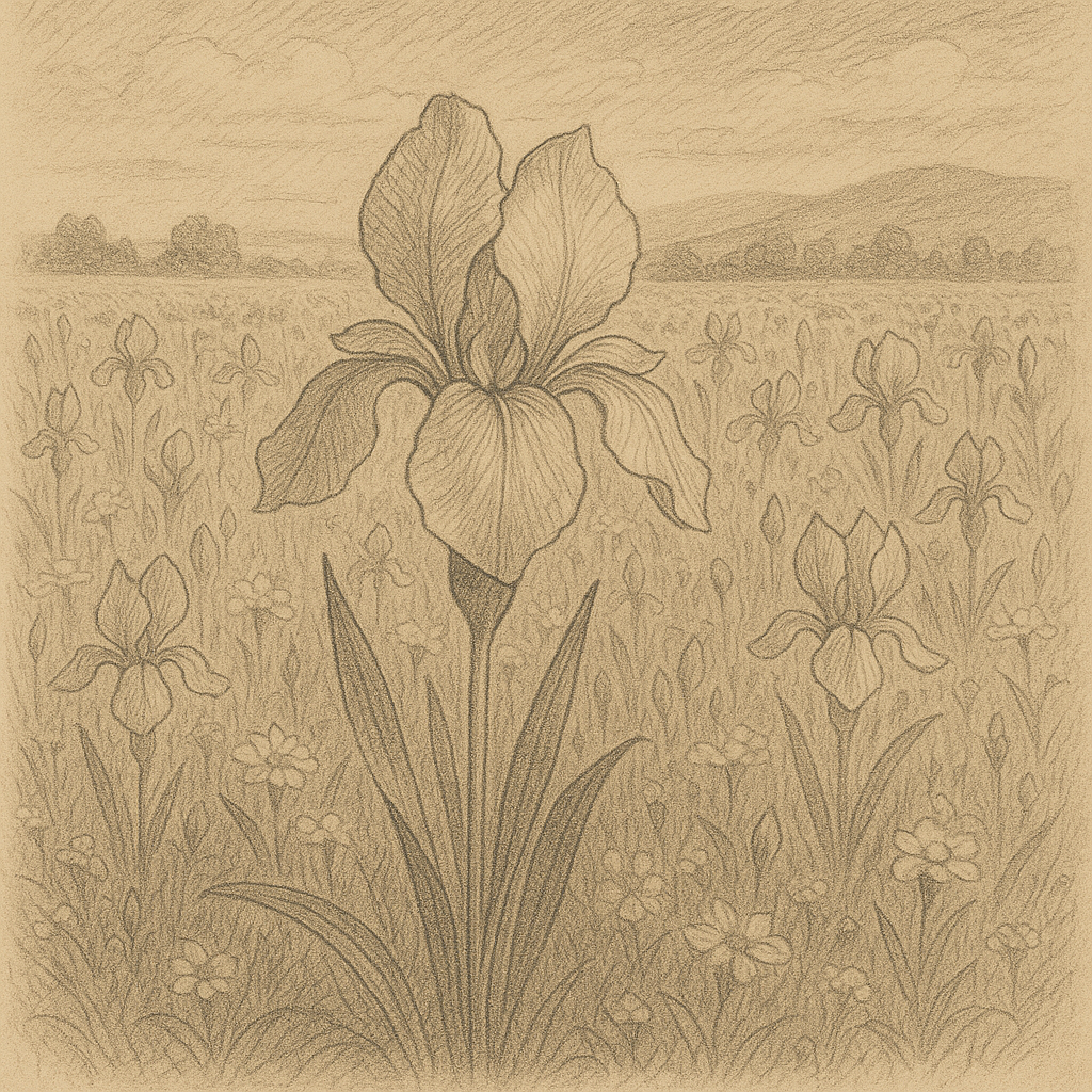
Subheading
Image with text
Use this text to share information about your brand with your customers. Describe a product, share announcements, or welcome customers to your store.
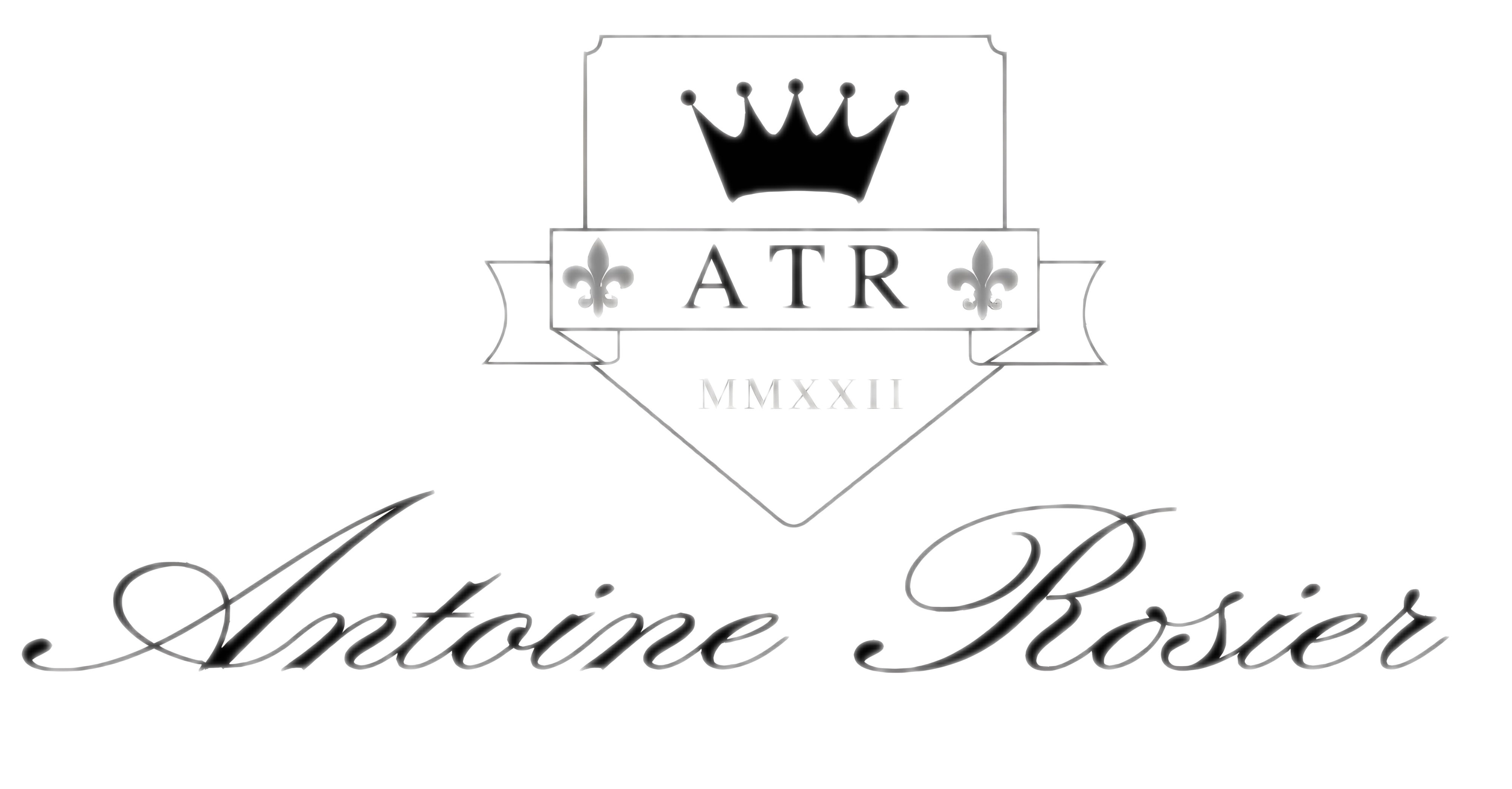
The Evolution of the Antoine Rosier Logo
The Antoine Rosier logo, as we know it today, has undergone much refinement and redesign over the years.
Modern influences are effortlessly interwoven with timeless classic elements, resulting in an emblem that captures the essence of refinement in an unparalleled way. Let’s take a look at the evolution of this iconic logo.
The first design of the logo
Although the logo has undergone significant transformations since then, the original version established the visual language that would continue to evolve, blending modern influences with classic elements. This first iteration set the tone for Antoine Rosier’s journey to become a symbol of refinement and luxury in the fashion world.
A new Direction
At that time, we were not satisfied with the shape and elements of the original logo. This led us to completely redesign the logo with a new shape and elements that better aligned with our vision.
We crafted a more elegant lion symbol, featuring cultivated Greek letters and modern accents, exuding strength and refinement. This transformation allowed us to develop a logo that represents not only luxury but also reflects our dedication to elegance and craftsmanship.
A Touch of French Refinement
We realized that the French essence of the Antoine Rosier brand was not sufficiently expressed in the old logo. Therefore, we carefully added two fleur-de-lis to our design, refined the font of 'Antoine Rosier,' and simultaneously introduced a new Roman element. This transformation not only reflects our commitment to elegance but also enhances the cultural richness that makes our brand so special.
The refined version and the one as we know him today
We realized that the French essence of the Antoine Rosier brand was not sufficiently conveyed in the previous logo. To address this, we thoughtfully incorporated two fleur-de-lis into the design, symbolizing our deep connection to French heritage.
Additionally, we refined the typography of “Antoine Rosier” to evoke a greater sense of sophistication and artistry. Alongside these updates, we introduced a subtle Roman element. This evolution reflects our continued commitment to elegance and the unique character that sets Antoine Rosier apart.